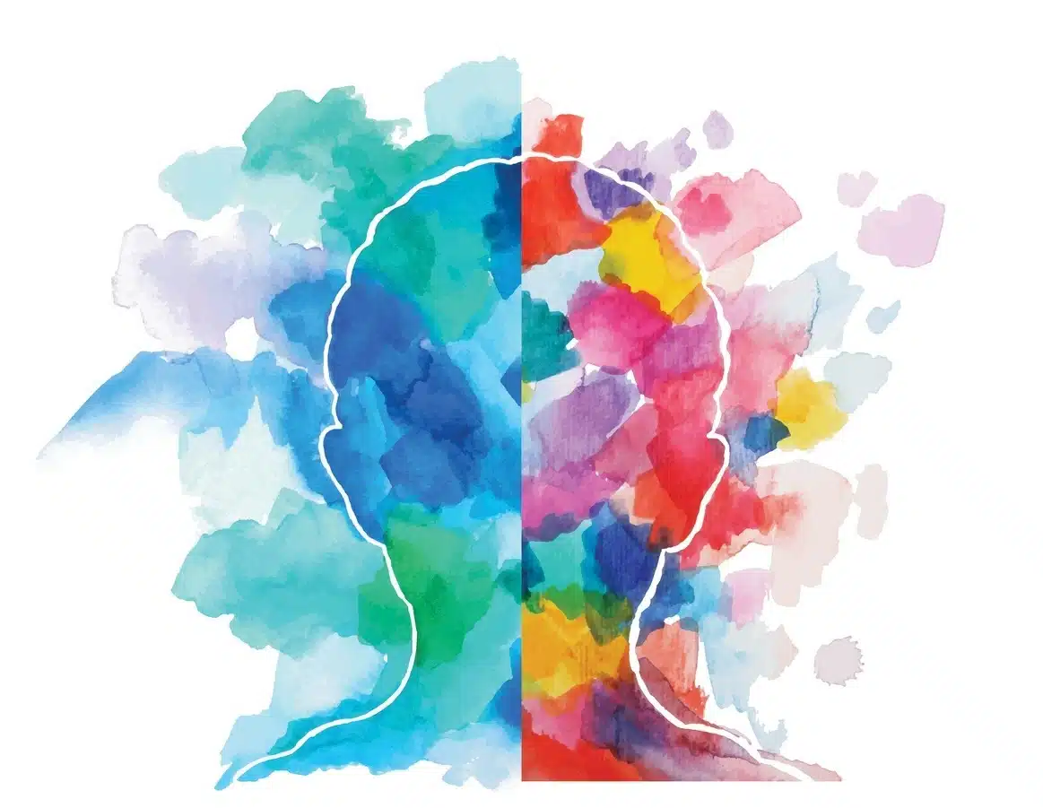
Colour is one of the essential elements that can affect the consumer and their behaviour without realizing it. Colour in the marketing context can trigger certain emotions and brand associations or even lead to a purchase. Businesses must learn about colour psychology as it helps them to engage the client’s emotions. For instance, red reflects urgency and excitement, which is why it is widely used in clearance sales. On the other hand, blue is associated with trust and relaxation, which is why you can often find it in banks’ branding, for example.
Colour psychology investigates how colour influences feelings and actions. This field is based on the theory that colours elicit psychological effects owing to cultural, personal, and contextual influences. For example, yellow is a colour associated with happiness and optimism, but it can also be associated with warning or caution. Marketers leverage these associations to develop messages that appeal to the intended consumers. Colour psychology is an excellent opportunity to enhance your audience experience by connecting colour emotionally to the brand.
Choosing the Right Brand Colour Palette
Aligning Colours with Your Brand Identity
Your brand’s colour palette is not just the design but your brand’s personality and character. When choosing the brand colour palette, ensure that the desired colours correspond to the brand’s image and message. For example, using greens and earthy colours will be appropriate if your brand is associated with environmental concerns and sustainability. Similarly, a tech-inclined organization might prefer neutral colours such as silver, black, and blue. Selecting beautiful and creative colours can positively impact your brand.
Best Colour Palettes for Brand Identity Across Industries
Every industry has a choice of colours that helps the intended audience relate. For instance, the healthcare industry uses blue and white colours to create a perception of hygiene, honesty, and steadiness. On the other hand, warm colours such as red, orange, and yellow are commonly used in the food and beverage industry because they help to create feelings of hunger and warmth. When you know the best colours to use in your brand image in your industry, you can develop a unique brand image that befits consumers’ perceptions.
Effective Colour Combinations for Branding
When branding, more than a simple selection of two or more good-looking colours is needed; the selected colours should blend well to pass the brand’s intended message. The use of colours opposite each other on the colour wheel may be pretty effective, as it will make your brand stand out.
Cultural and Psychological Influences on Colour Perception
Adapting Your Brand Colour Palette for Different Cultures
In different cultures, people perceive different colours in various ways. For example, while white is seen as innocence and calmness in the countries of the West, it is regarded as mourning in some Asian countries. In the same way, the colour red, which embodies luck and prosperity in Chinese culture, may be interpreted differently in other cultures. This way, brands can develop advertising campaigns appropriate to the country’s culture and minimize misunderstandings.
Gender Preferences in Colour Choices
A study established that male and female perspectives are different when it comes to selecting colours. For instance, research shows that male subjects prefer shades such as blue and black instead of female subjects, who would prefer pastel colours such as purple and pink. When choosing colours for the brand, consider such preferences by gender if you are targeting a specific sex—male or female. It is essential to align the colour choices with the target group because it can boost the branding strategies.
Harmonies and Contrasts
Examples of colour schemes are monochromatic, analogous, and triadic schemes, which can be applied to create different feelings and looks. A single-hue design with varying shades of blue will create a corporate feel that is perfect for branding. On the other hand, the complementary colour scheme can produce high contrast and attract attention, which suits brands that want to be distinctive or innovative as part of the unique selling proposition. Colour theory is critical because it allows you to build a solid and recognizable brand image.
Ensuring Consistency and Professionalism
Maintaining a Cohesive Brand Colour Palette Across All Platforms
It is vital to maintain brand identity and cohesiveness. When colours are not well coordinated, they dilute the message you are trying to convey to your audience. To have a coherent and consistent design, develop a strict and precise brand colour palette containing the exact colour codes and their application in various situations. Then, regardless of where your brand is placed, it can easily be associated with your brand and have a sense of uniformity.
The Benefits of Working with Professionals
Although it is possible to develop a brand colour scheme on your own, engaging skilled and talented experts to help establish your branding is even better. When you hire a graphics design agency such as Momentum360, you will work with people who fully appreciate the concepts of colour psychology and how to optimize them for marketing. At Momentum360, we create stunning, engaging website designs that match your business objectives.
Our team will assist you in choosing a suitable colour scheme for your brand to portray the correct message to your audience and customers. Also, we create a detailed brand manual to ensure that all your promotional items are coordinated with a consistent brand image.
A/B Testing for Effective Color Combinations for Branding
Branding professionals find A/B testing a highly effective technique for identifying the right colour combinations for their target audiences. When using colour combinations in your marketing collaterals, collect information on the impact of these colours on marketing communication, conversion rates, and brand image.
It is a very effective way to make your brand colour as effective as possible, as the data is collected and analyzed. For instance, it is possible to discover that a specific hue of blue will be more effective as a call-to-action button than red because it brings better click-through rates. Choosing the right colour for your project may be daunting without the facts, but A/B testing eliminates the guesswork.
Conclusion
Colour psychology in marketing is essential for developing a sound and compelling brand image. Therefore, choosing the brand colour range can improve brand familiarity, elicit the necessary emotions, and persuade consumers to take action.
Momentum360 is here to help your brand or business with our professional graphic design and full-service digital marketing solutions. An engaging and attractive colour scheme is essential for your desired outcome.